Data Challenge Lab Home
Spatial visualization [visualize]
(Builds on: Spatial basics)
library(tidyverse)
library(sf)
In Spatial basics, you learned how to plot spatial data using the
plot() function. Now, we’ll show you how to visualize spatial data
using geom_sf(). geom_sf() has the advantage of being part of
ggplot2, meaning you can layer geoms, use scales functions to change
colors, easily tweak legends, alter the theme, etc.
geom_sf()
The ussf package makes it easy to
create maps of the U.S. by supplying state, county, or commuting zone
boundaries. Use geography = "state" to return boundaries for all U.S.
states.
states <- ussf::boundaries(geography = "state")

states %>%
  select(GEOID, NAME, geometry)
#> Simple feature collection with 51 features and 2 fields
#> geometry type:  MULTIPOLYGON
#> dimension:      XY
#> bbox:           xmin: -2358696 ymin: -1338125 xmax: 2258154 ymax: 1558935
#> epsg (SRID):    NA
#> proj4string:    +proj=aea +lat_1=29.5 +lat_2=45.5 +lat_0=37.5 +lon_0=-96 +x_0=0 +y_0=0 +datum=WGS84 +units=m +no_defs
#> # A tibble: 51 x 3
#>    GEOID NAME                                                           geometry
#>    <chr> <chr>                                                <MULTIPOLYGON [m]>
#>  1 24    Maryland   (((1722285 240378.6, 1725330 242308.6, 1728392 239316.5, 17…
#>  2 19    Iowa       (((-50588.83 591418, -46981.68 596802.6, -43690.9 602462.9,…
#>  3 10    Delaware   (((1705278 431220.8, 1706137 435509.7, 1708323 439919.9, 17…
#>  4 39    Ohio       (((1081987 544758, 1084616 548413.9, 1088580 545713.1, 1088…
#>  5 42    Pennsylva… (((1287712 486864, 1286266 495787.9, 1283800 511007.6, 1283…
#>  6 31    Nebraska   (((-670097.4 433429.4, -668488.7 451690.8, -667385.4 464518…
#>  7 53    Washington (((-2000238 1535265, -1987818 1533508, -1983536 1534701, -1…
#>  8 01    Alabama    (((708460.5 -598742.7, 708114 -594376.4, 708487.4 -580948.4…
#>  9 05    Arkansas   (((122656.3 -111221.4, 145436.8 -110838.5, 170649.1 -110435…
#> 10 35    New Mexico (((-1226428 -553334.3, -1221959 -521613.4, -1216674 -483827…
#> # … with 41 more rows
We can use geom_sf() to plot the state boundaries.
states %>%
  ggplot() +
  geom_sf()
We don’t have to supply any aesthetic mappings to ggplot().
geom_sf() will, by default, use the column that stores simple features
data. This column will be of class sfc and typically be called
geometry.
class(states$geometry)
#> [1] "sfc_MULTIPOLYGON" "sfc"
Projections
The Earth is not flat, but your plots are. To create effective maps, you’ll need to project a three-dimensional shape (the Earth) onto a two-dimensional surface (your screen).
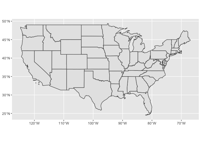
Latitude and longitude coordinates are unprojected. Each point picked out by a longitude and latitude combination specifies a point on an ellipsoid. This means that plots of large geographic areas, like the U.S., will look strange when plotted in longitude-latitude.
states_longlat <-
  ussf::boundaries(geography = "state", projection = "longlat")

states_longlat %>%
  filter(!(NAME %in% c("Alaska", "Hawaii"))) %>%
  ggplot() +
  geom_sf()
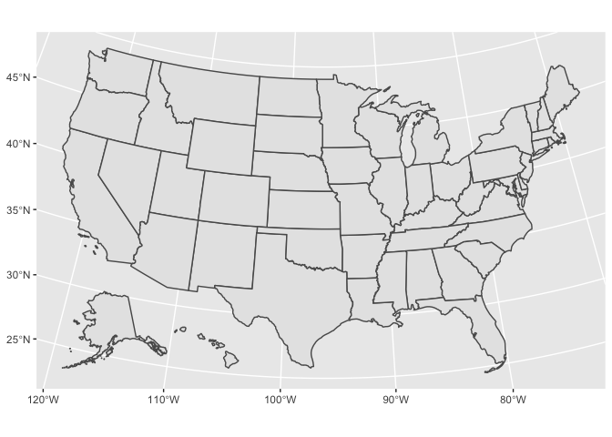
A different projection will improve our map substantially. When mapping the entire U.S., we recommend U.S. Albers. U.S. Albers is the default for the ussf package.
states_albers <- ussf::boundaries(geography = "state")

states_albers %>%
  ggplot() +
  geom_sf()
Anytime you project a three-dimensional object onto a two-dimensional object, some aspect of the object will be distorted. U.S. Albers chooses to accurately reflect area, at the cost of minimally distorting scale and shape.
ussf also scales Alaska and Hawaii and places them below the continental U.S. This is not related to the Albers projection.
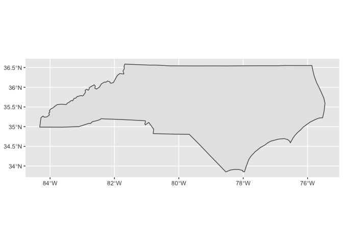
If you’re visualizing a small geographic area, like North Carolina, you can just use longitude and latitude. The Earth is approximately flat for a small enough area.
states_longlat %>%
  filter(NAME == "North Carolina") %>%
  ggplot() +
  geom_sf()
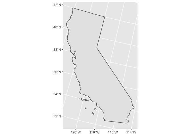
However, California covers a bit too much area for this to work. On its own, California also looks strange if projected with U.S. Albers.
states_albers %>%
  filter(NAME == "California") %>%
  ggplot() +
  geom_sf()
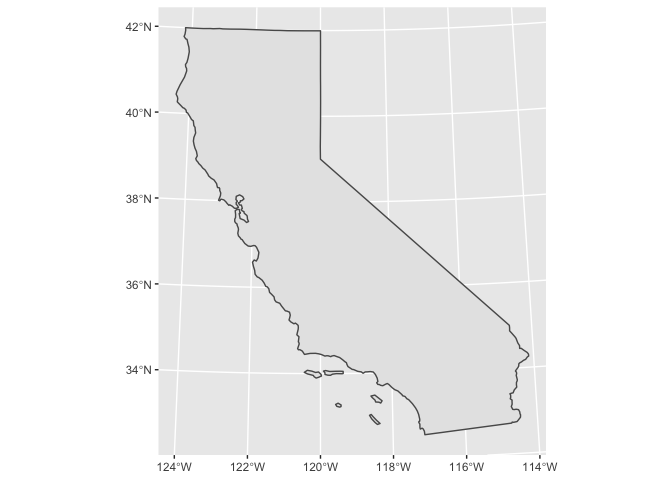
Luckily, there’s an Albers equal area projection just for California, called California Albers. You can specify the projection and coordinate reference system for a map using PROJ strings. Here’s the PROJ string for California Albers.
CA_ALBERS <-
  "+proj=aea +lat_1=34 +lat_2=40.5 +lat_0=0 +lon_0=-120 +x_0=0 +y_0=-4000000 +ellps=WGS84 +datum=WGS84 +units=m +no_defs"
aea stands for Albers equal area, and we are using the WGS84 coordinate reference system. The Spatial Reference website is a good place to look up PROJ strings.
We can change the projection before plotting with st_transform().
states_albers %>%
  filter(NAME == "California") %>%
  st_transform(crs = CA_ALBERS) %>%
  ggplot() +
  geom_sf()
Choropleths
Say we want to visualize population density across California counties.
population contains population data for California counties.
population
#> # A tibble: 58 x 3
#>     fips name                            population
#>    <int> <chr>                                <dbl>
#>  1  6001 Alameda County, California         1666753
#>  2  6003 Alpine County, California             1101
#>  3  6005 Amador County, California            39383
#>  4  6007 Butte County, California            231256
#>  5  6009 Calaveras County, California         45602
#>  6  6011 Colusa County, California            21627
#>  7  6013 Contra Costa County, California    1150215
#>  8  6015 Del Norte County, California         27828
#>  9  6017 El Dorado County, California        190678
#> 10  6019 Fresno County, California           994400
#> # … with 48 more rows
(We obtained the population data from the Census Bureau’s Population Estimates API. See our chapter on Census Bureau APIs for more information.)
We’ll join our population data with boundaries from
ussf::boundaries(). Because we’re looking at a smaller area, we can
use a higher resolution than the default.
FIPS_CA <- 6L

ca_counties <-
  ussf::boundaries(geography = "county", resolution = "5m") %>%
  filter(as.integer(STATEFP) == FIPS_CA) %>%
  st_transform(crs = CA_ALBERS) %>%
  transmute(
    fips = as.integer(GEOID),
    area_land = ALAND
  ) %>%
  left_join(population, by = "fips") %>%
  select(fips, name, population, area_land)

ca_counties
#> Simple feature collection with 58 features and 4 fields
#> geometry type:  MULTIPOLYGON
#> dimension:      XY
#> bbox:           xmin: -373976.1 ymin: -604512.6 xmax: 539719.6 ymax: 450022.5
#> epsg (SRID):    NA
#> proj4string:    +proj=aea +lat_1=34 +lat_2=40.5 +lat_0=0 +lon_0=-120 +x_0=0 +y_0=-4000000 +datum=WGS84 +units=m +no_defs
#> # A tibble: 58 x 5
#>     fips name         population area_land                              geometry
#>    <int> <chr>             <dbl>     <dbl>                    <MULTIPOLYGON [m]>
#>  1  6003 Alpine Coun…       1101   1.91e 9 (((-6313.368 54862.23, -6288.982 763…
#>  2  6109 Tuolumne Co…      54539   5.75e 9 (((-57354.39 -20135.31, -56604.18 -1…
#>  3  6103 Tehama Coun…      63916   7.64e 9 (((-260050.9 256364.8, -259224.1 256…
#>  4  6105 Trinity Cou…      12535   8.23e 9 (((-304746.5 329673.1, -304086.2 329…
#>  5  6069 San Benito …      61537   3.60e 9 (((-146300.2 -123496.5, -144972.2 -1…
#>  6  6091 Sierra Coun…       2987   2.47e 9 (((-90893.55 169529.6, -89956.05 170…
#>  7  6017 El Dorado C…     190678   4.42e 9 (((-98544.49 77921.37, -95712.73 860…
#>  8  6053 Monterey Co…     435594   8.50e 9 (((-176798.7 -157764.9, -176064 -157…
#>  9  6057 Nevada Coun…      99696   2.48e 9 (((-110362.9 135706, -108569.7 13855…
#> 10  6071 San Bernard…    2171603   5.20e10 (((204595.5 -443243.5, 206219.5 -443…
#> # … with 48 more rows
Note that you have to supply the boundaries data as the first argument
of left_join(). If you supply it as the second, the tibble will lose
its sfc class, and geom_sf() will no longer work as expected.
Just like with other geoms, you can supply additional aesthetics to
geom_sf(). For polygons like the counties of California, fill is the
most useful aesthetic. Let’s visualize population density by county.
area_land is in square meters, but we’ll express density in terms of
population per square mile.
ca_counties <-
ca_counties %>%
mutate(density = population / (area_land * 3.861e-7))
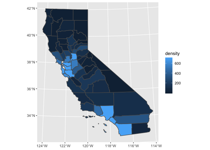
ca_counties %>%
ggplot(aes(fill = density)) +
geom_sf(color = "white", size = 0.2)
Maps like this one, in which geographic areas are colored according to some variable, are called choropleths.
Our map has a substantial problem. It’s pretty much all the same color! It’s very difficult to tell the difference in population density between counties, particularly for low-density counties.
Let’s look at the distribution of density.
ca_counties %>%
  ggplot(aes(density)) +
  geom_histogram(binwidth = 200)
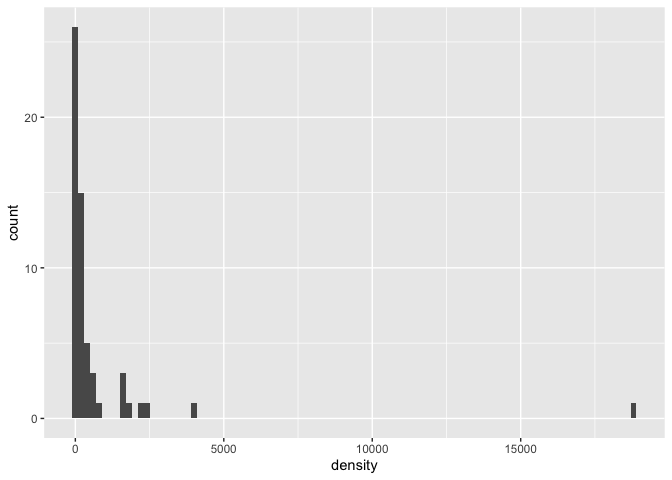
Most of the counties are low density, but there are some outliers. By default, our sequential color scale will linearly map colors between the minimum (1.49) and the maximum (18,849). (The extreme outlier is San Francisco County.)
One way to deal with this problem is to cap density using pmin().
Now, everything above our cutoff will be represented with the same
color.
ca_counties %>%
  mutate(density = pmin(density, 700)) %>%
  ggplot(aes(fill = density)) +
  geom_sf()
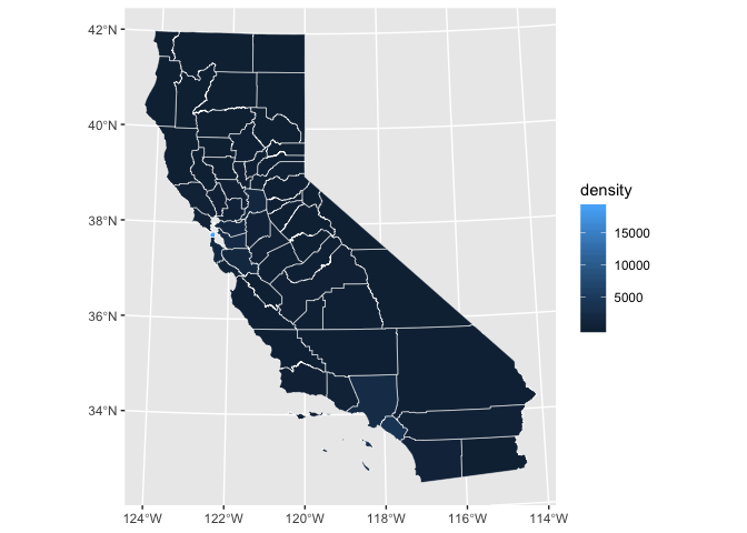
This map makes it much easier to see the high density areas and compare the lower density areas to each other. A better color scale and thinner borders will also improve our plot.
ca_counties %>%
  mutate(density = pmin(density, 700)) %>%
  ggplot(aes(fill = density)) +
  geom_sf(size = 0.3) +
  scale_fill_gradientn(
    colors = RColorBrewer::brewer.pal(n = 9, name = "PuRd")
  )
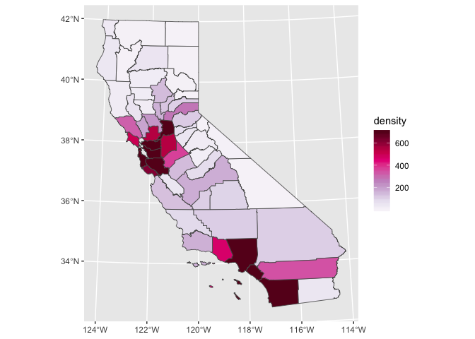
You can find this lighter color scale, and many others, at the
ColorBrewer website. You can also browse
all the palettes included in the RColorBrewer package by running
RColorBrewer::display.brewer.all().
If you do truncate a variable to improve your color scale, make sure to clearly indicate that you did so in your legend.
labels <- function(x) {
  if_else(x < 700, as.character(x), "700+")
}

ca_counties %>%
  mutate(density = pmin(density, 700)) %>%
  ggplot(aes(fill = density)) +
  geom_sf(size = 0.3) +
  scale_fill_gradientn(
    breaks = scales::breaks_width(width = 200, offset = -100),
    labels = labels,
    colors = RColorBrewer::brewer.pal(n = 9, name = "PuRd")
  )  +
  theme_void() +
  labs(
    fill = "Population density\n(population / square mile)"
  )
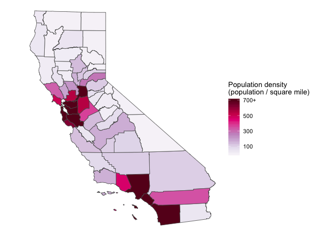
theme_void() is an easy way to remove the grid lines and tick mark
labels, which aren’t necessary for someone to understand our map.
Layering
Just like with other geoms, you can layer geom_sf() with additional
geom_sf()s or other geoms.
Previously, we’ve been plotting multipolygons with geom_sf().
class(ca_counties$geometry)
#> [1] "sfc_MULTIPOLYGON" "sfc"
Recall that sf stands for simple features and there are many types
of simple features, including multipolygons, lines, and points. If
geom_sf() encounters a point, it will plot a point.
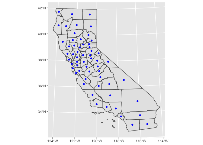
ca_counties %>%
  ggplot() +
  geom_sf() +
  geom_sf(
    color = "blue",
    data = . %>% mutate(geometry = st_centroid(geometry))
  )
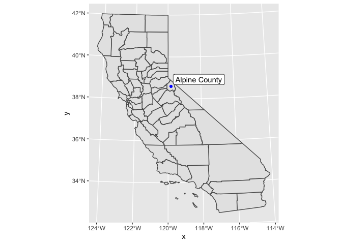
You can also use geom_sf_label() or geom_sf_text() to add text to
your maps.
lowest_density <-
  ca_counties %>%
  top_n(n = -1, wt = density)

ca_counties %>%
  mutate(density = pmin(density, 700)) %>%
  ggplot() +
  geom_sf() +
  geom_sf(
    color = "blue",
    data = lowest_density %>% mutate(geometry = st_centroid(geometry))
  ) +
  geom_sf_label(
    aes(label = str_remove(name, ", California")),
    hjust = -0.05,
    vjust = -0.1,
    data = lowest_density
  )
Zooming
Just as you can use coord_cartesian() to zoom in on a normal plot, you
can use coord_sf() to zoom in on your map.
Let’s just plot Hawaii. We’ll use projection = "longlat" because
Hawaii covers only a small area. Also, setting project = "albers"
would scale Hawaii and place it under Texas.
hawaii <-
  ussf::boundaries(
    geography = "state",
    resolution = "500k",
    projection = "longlat"
  ) %>%
  filter(NAME == "Hawaii")

hawaii %>%
  ggplot() +
  geom_sf()
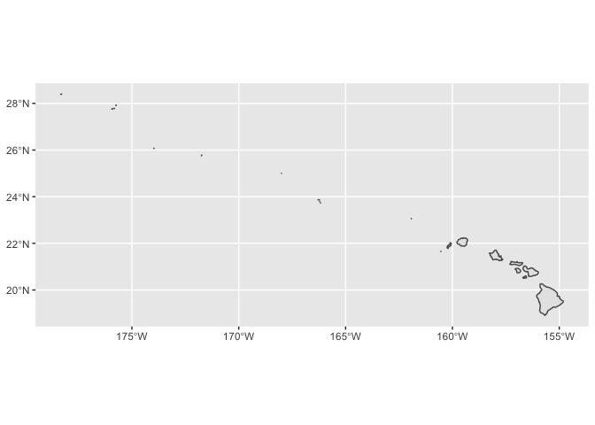
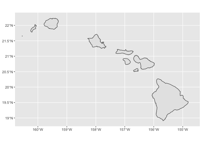
We can use coord_sf() to zoom in on the main islands.
hawaii %>%
  ggplot() +
  geom_sf() +
  coord_sf(
    xlim = c(-160.5, -154.7),
    ylim = c(18.9, 22.25)
  )